
During many hours of researching the Internet for Okanagan based tourism websites, I was disappointed to find many tourism and event websites were not well built, and many of those were DIY (Do It Yourself) websites.
Those websites were lacking on so many levels. Some were hard to access due to poor settings, others hard to navigate through a poor menu system and page setup, and most were poor in the quality and quantity of information that is important, such address, contact information, location information (seasonal periods), etc.
As a result of what I found, I created this Help Guide to Building Good Tourism-Event Websites.
Below are some basic guidelines to better your tourism website so it becomes attractive to tourists visiting it.
Basic requirements summarized
The basic requirements for a good website are:
- Easy to find : in search engine results,
- Easy accessibility : proper HTTPS settings,
- Easy navigation : good, simple menu and page/link navigation,
- Easy usability : can find core/crucial information easily, forms easy to use, media easy to view,
- Information is organized : core, crucial information is laid out to easily locate, read and understand,
- Text content : in small blocks, with enough white (empty) space to avoid clutter and is concise and direct,
- Text content size : for the body of text, at least 16px, and the font style clearly readable (avoid fancy scripts and scrolls unless it is part of an image).
- Proper use of headings : good use of H1 to H6 headings (see this guide for details about the use of headings: “How to use header tags“).
- General Color contrast : good contrast that is easy on the eyes, avoiding clashing colors.
- Text colors: light color on dark backgrounds or dark color on light backgrounds.
- Images : should relate to the content, real images from the tourism service or event.
- Image clutter : avoid too many images and clumped together or too close to each other, as well keeping image galleries to the minimum.
- Think practical and common-sense : as the basis to build your website, avoid fancy or trick animations that only distract.
- Never Assume : visitors can read your mind or intentions. The information on your website must be clear, concise, informative on all levels.
- Think of how to benefit your potential visitors : how well can you inform them with your website.
- Updating : always keep your website up to date, both its core functions as well as the core information about your tourism service or event, especially when it is seasonal.
There is a simple motto to keep in mind:
Care About Your website,
— your visitors will be impressed the same way about you because of it.
Build it Like You Mean It
To expand on some of the summarized points above, here are a few core guidelines below to create that valuable tourism website:
Contact Information & Location
I am sure you have heard the phrase used to denote a successful business, “Location, location, location”?
Well, it is no different for a successful business website or a successful tourism or event website, Contact information and “the location” are crucial because they are core to the event or to the tourism location.
There is nothing more frustration for visitors to a website who seek information about a tourism service or event location to find nothing, because it is not there, or to never find it when it is there, somewhere hidden or buried.
When your website is promoting a business, tourism site or event location, all information pertaining to it must appear on the website for potential visitors to know where you are and how to contact you for more information.
Two types of information
There is core information and event information.
Core Information: refers to the main location of the tourism site or business where events are organized and can be the same location where events are held.
Event Information: refers to the location where the event is held, which can be the same as the core location, but usually is held elsewhere.
Organizing the information
Event location same as Core Location: if the event location is the exact same as the core location, then the website must show that information for visitors and be easily seen and accessed on the main website (see below, “Where to place the core information“).
Event location is elsewhere: if the event location is elsewhere, separate from the core location, then two sets of information (core and event information) must be visible and easily accessible to website visitors.
The core information is for the main tourism site or business, then set out separately on the website, clearly and easily seen, is the event information (see “Places to insert temporary information“).
Event Location becomes Core Information: Sometimes, a separate website is created for the specific event. In this case, the event location becomes the core information because the website is created specifically for it.
Main Information of the tourism site
Be informative, detailed accordingly and concise.
Key purpose is to “keep your potential visitors/customers informed“.
The main information is:
- Address
- City or town name
- Phone number (if you provide a local number and Toll Free number, include both).
- Email Address
- Hours (regular days, weekends, holidays, seasonal).
- Open seasonally? – provide your seasons (months) of operation. If the opening season changes relative to weather, provide a reference to the likely month with a rider that it is weather permitting and you will provide an update at that time.
- Google Map (Google Map API, or an linked image of your map location linking to a Google Map, or just a link).
- ALWAYS update your website when the above information changes, even if it is temporary.
Where to place the core information
- Top Bar Area or the Footer Area (or both). This will then show on all pages of the website
- For core information as hours, may not fit in the top bar, then place it in the footer and…
- On the Contact Page (here too is a benefit).
- As an option, create specific page created just for it and ensure your main menu has linked menu item for it.
Examples – Contact / Location text in Top Bar and Footer
[Location, Contact Info – Top Bar Example]

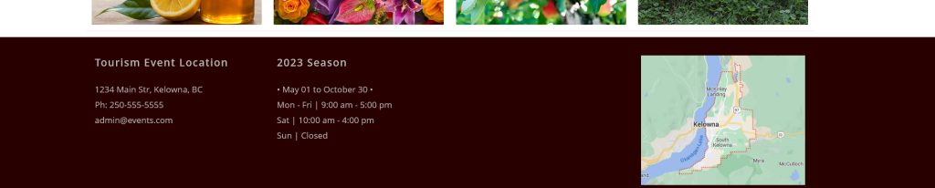
[Location, Contact Info, Hours – Footer Example]
Website Themes
Since the examples of using the Top Bar and Footer were given as good places to display core information, then the quality of website themes becomes important to building a quality tourism or event website.
- Choose a theme that provides a Top Bar and Footer Area. Good themes always do. Minimalist themes may not.
- Some themes provide a Footer just for the copyright information, then immediately above provide an area that you can divide into sections (2 to 4 sections) where you can insert your core information. (The footer example above is divided into 4 sections.)
Places to insert temporary information
This information refers to events that have a short life span, which are specific events created for a short duration of the tourist season.
If the event exists during the entire tourist season and the website is made specifically just for it, then it is considered Core Information and treated as such on the website.
Examples for time sensitive event information or temporary notices:
- In the body of the home page, this is where people go to first.
Ensure it is visible, clear, concise and not buried in paragraphs or cramped between images,
even create a part of the page specifically for this information so it stands out.
- In the footer area as a special notice (if the website theme provides enough space).
- On the contact page.
- Any other pages that pertain to that information, even to create a page dedicated for it.
- ALWAYS keep this information up to date or remove it when out of date.
Bad Habits to Avoid
- Never bury location or contact information in sentences, paragraphs or in images or cramped between images.
Reason, people visually scan web pages and seldom read every word. When core information is buried, they will miss it and get frustrated trying to scan for it.~ Bad Example (location buried in a paragraph, and poorly done at that) ~
“It is a great location, filled with trees and green grass and a lake to boot.
Spend all day if you want, bring the family. It is easy to find on Main street,
just go to the end of the street and park anywhere. Its fun to be in Kelowna on a sunny day.”
- Avoid trying to cram or wrap text information around images, especially large images. Keep the text separate from any images where it is easy to see.
- Avoid breaking the core information up on the page or on the website between many pages. Keep it together.
- Avoid text/font size that is too small, like this.
- Avoid fancy looking font styles for the main text content. A font style must be readable. Standard fonts are “Helvetica, Arial, Tahoma, Verdana, Georgia or Times Roman (Times New Roman)” are the best readable font styles for text content. Fancy fonts are reserved for special titles of the website and promo images.
- Never assume people understand your personal lingo. Use Plain English, correctly stated and in full is best.
- Avoid abbreviations, unless it is commonly known, for example the address (ie: Ave. or Str.).
Examples of How to post contact or location information
When entering the contact or location text information into the main body of text, use a “card style format”, even in bullet format works (without the bullets is best).
Good Example – (Location text within body of page)
Location:
1234 Main Str, Kelowna, BC
(go to the end of the street).
Images and Location or Contact Information
When using images to show contact or location text information, ensure that information is not buried into the image. There is a good and bad way to use images.
The key is to ensure clarity, make it easily seen, separated from other elements on the page including other body text.
~ Bad Example using images (location text embedded into an image) ~

~ Good Example using images (with embedded text, location text is separate) ~
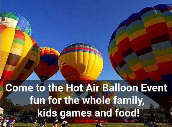
☆ Location: end of Main Str., Kelowna, — 4:00 PM ☆
Images (in general)
Including images for your website is important. It adds to the text content and breaks up text, if placed appropriately.
Here are some guidelines to using images:
- Images should reflect the subject matter of your website, event, location, etc.
- Avoid generic images on the Internet, take pictures yourself if possible.
People want to see what is real from your event or location, not some generic image they will likely see elsewhere in the Internet. - Resize images from digital cameras because they are too large in raw form.
A good size is to start is with a width of 750 px for the body content of the pages.
Resize images before you upload it, because resizing the image in the website sometimes does not work well and it fills up your hosting account storage limit with extra images. - Header slide images will be wider (around 1500 px – 1900 px) with a max height of 600 px max.
Remember, the text content is King for the website, not the images or the header image. - All images are meant to compliment and support the text content (information), not replace it.
When images overwhelm or dominate a tourism website or event website, you have lost your visitors.
Text Content is King
Yes, text content is King. it is what makes or breaks the website, so here are some guidelines:
- Brief and concise — short paragraphs. Verbose distracts and discourages visitors because they don’t want to be spending a lot of time reading text when they just want to get the information they seek about your tourism service or event.
- Home pages are always in brief and concise format — because it is easier to read and faster for people to look over.
- Be informative — about your location or event or services.
Thus, create content for people who know nothing about your location or event, then everyone will be properly informed. - Categorize your information — to make it easier to create and organize.
- Use titles — for different sets of text information
- Avoid cramming content — into a website, because too much makes it harder to access in mobile devices, let alone too much even for desktop browsers.
Create Content that works for Mobile Screens
Mobile devices are a close second to a desktop browser, where a majority of visitors, seeking information on tourism locations or events, use their smartphones to search the Internet to find tourism related websites that would help give them the information they need. This is especially important because tourists are mobile and most of their access to the Internet is by their own mobile devices, not their desktop (includes laptop) computers.
Thus, when building and organizing your tourism website, it is very important to keep in mind “mobile guidelines” when creating content for your website:
- Font Size — should be a minimum 16px to be readable in mobile devices.
- Paragraphs of Text — should be small because in mobile screens, a paragraph becomes a larger one due to smaller screens.
- Images Must Be Clear — avoid putting text too close to images to ensure text vs image alignment in mobile screens is good.
- Avoid Long Web Pages — unless absolutely necessary, because in a mobile device the page can become 2x to 5x longer due to smaller mobile screens.
- Test your Website — in your own smartphone. Make adjustments accordingly.
Social Media Pages
It is important to understand that social media pages are to support, to supplement the main website.
Social media pages should never replace a main website.
Information that appears on your social media pages as location, hours, contact information, ticket information, etc should first be on your main website, then added to your social media pages to supplement and increase visibility.
Social media pages are important, but always second to a main website.
The only difference that does not show on your main website is your social media pages will contain social media content as comments, images posted by you and visitors, etc.
To understand how to use social media, here are some guidelines:
- Social media pages are an extension of the main website, so core information from the website is duplicated here.
- Extra content in social media as comments, images, etc, do not have to be on the main website, but you can take selected social media content to also post on the main website.
- Ensure your social media pages are linked (via icons) on the main website
- Ensure your social media home page is set to public view, meaning people don’t need to log into the social media site to see the first landing page of your social media account. Reason is not everyone have accounts, or even want to have an account at the same social media site (ie: Facebook).
How to Treat Your Tourism Website
Your website is part of your life blood for your event or business.
It is far cheaper to use than a newspaper Ad and provides far more visibility to local residents and visitors than regular media as newspapers, TV, etc.
Why is a website better? – because people access the Internet for information far more than they use the news paper or TV.
Social media pages are not main websites, they are supplement to a main website, so if you don’t have a main website, get one.
Always treat your main website as an important tool for a successful business.